Views Preferences
The Views preferences are grouped in the following categories — Views, Colors, Fonts, 2D Settings,
 Selecting the Views Preferences
The Views preferences, shown below, determine the appearance of the workspace, the default units and significant digits of measurements, the language of the application, and the default scene view. Choose Views in the Preferences dialog to see the Views preferences, shown below.
Views preferences

You can select the following the Views preferences:
| >Description | |
|---|---|
| Significant digits for measurements |
Determines how many decimal places are displayed for measurements.
|
| Current view border size |
Determines the size, in screen percentage, of the border applied to a view to indicate that it is selected. At a value of 0, no border will be visible.
|
| Scene separators size |
Determines the size, in pixels, of the borders separating scenes in the workspace. At a value of 0, no border is shown.
|
| View separators size |
Determines the size, in pixels, of the borders separating views within a scene. At a value of 0, no border is shown.
|
| Default unit |
Determines the default unit displayed for measurements.
|
| Default angle unit |
Determines the default unit displayed for angles — degrees or radians.
|
| Language |
Determines the language of the application. Note that changes to this preference will only be effective when the application is restarted.
|
| Default scene layout |
Determines the scene view that appears by default in the workspace. For example, when you start the application, create a new session, or add a new scene to the workspace. See Scenes and Views for information about the different scene layouts and views that are available.
|
Selecting the Colors Preferences
The Colors preferences determine the color of text annotations, borders, and annotations, as well as the background color of views. Choose Views | Colors in the Preferences dialog to view the Color preferences, shown below.
Colors preferences

Click the color swatch associated with any of the available items and then choose a new color in the Color dialog, if required (see Choosing Colors).
| Item | Description |
|---|---|
| Background | 3D views… Determines the background color, gradient, or background image applied to 3D views. Backgrounds can be selected in the 3D Views Background Color dialog, shown below
Do the following to change the background color or gradient of 3D views:
Do the following to choose an image file as the background for 3D views:
2D views… Determines the background color applied to 2D views. Do the following to change the background color of 2D views:
|
| General colors |
Determines color of scene and views separators, clip lines, measurements, histograms, and other items.
Text annotations… Determines the color of the text annotations. Text annotations shadow… Determines the color of shadows drawn under text annotations. You must select the Draw text annotations shadow option at the bottom of the dialog to show shadows for the text annotations. Highlight…. Determines the color applied to the border of selected objects. Current view border… Determines the color of the border applied to a view within a scene to indicate that it is selected. See Selecting the Views Preferences for information about selecting a border size. Scene separators… Determines the color of the borders separating scenes in the workspace. See Selecting the Views Preferences for information about selecting a border size. View separators… Determines the color of the borders separating views within a scene. See Selecting the Views Preferences for information about selecting a border size. Range selection… Determines the highlight color applied to intensity range selections made in the Range box on the ROI Tools panel (see Defining Intensity Ranges). Virtual floor… |
| Clip box |
Determines the colors for selected and unselected Clip boxes, as well as for the axis arrows and tick marks associated with Clip boxes.
Selected… Determines the color of selected Clip boxes. Unselected… Determines the color of unselected Clip boxes. X axis… Determines the color of X axis arrow. Y axis… Determines the color of Y axis arrow. Z axis… Determines the color of Z axis arrow. Ticks color… Determines the color of the graduated tick marks. Plane color… Determines the color of the selected plane of a Clip box. |
| Shape lines | Lets you select the colors for selected and unselected shape lines. |
| MPR planes | Determines the color that identifies each 2D plane in the scene views. MPR plane colors are also applied to the 3D Cursor and to visual planes in 3D views. |
| Measurements and other annotations |
Determines the color of measurements, such as rulers, angles, regions, and points, as well as other annotations, such as the scale bar.
Normal… Determines the default color of measurements and non-text annotations. Selected… Determines the color of selected measurements and non-text annotations. Selected control points… Determines the color of the currently active control point of a measurement. Text… Determines the color of text associated with measurements and other annotations. Text shadow…. Determines the color of shadows drawn under the text associated with measurements and other annotations. You must select the Draw other annotations text shadow option at the bottom of the dialog to show shadows. Scale bar… Lets you choose the color of the floating scale bar in 2D views. |
| Histograms |
Determines the colors associated with histograms, for example in the Window Leveling panel and Intensity Profile dialog.
Background… Determines the background color of histograms. Bins… Determines the color of the bins within histograms. Bin edges… Determines the color of bin edges. Range… Determines the color of the selected range window that appears over histograms. Labels… Lets you choose the color of the labels that appear in histograms. |
| Image processing |
Determines the colors associated with the Image Processing panel.
Selected filter… Determines the color applied to the border of a filter box when it is selected. |
| DICOM |
Determines the color of items listed in the Manage DICOM Images dialog and Attributes dialog.
DICOM browser lists' normal items… Determines the font color of read items listed in the Manage DICOM Images dialog. DICOM browser lists' unread items… Determines the font color of unread items listed in the Manage DICOM Images dialog. DICOM browser lists' series that contain sub-series… Determines the font color of items in the Manage DICOM Images dialog that contain sub-series. A DICOM series is an image or a group of images acquired from a single modality during a single encounter. A sub-series can be defined as a series in which a specified field has more than one discreet value. For example, a series that has two different Echo numbers may be two different acquisitions that were mistakenly stored together. Attribute browser's list items that are sequences… Determines the font color of data fields that contain multiple data elements in the DICOM Attributes dialog. The DICOM standard allows an attribute to contain multiple data elements. This means that the value of a data element may contain a number of items. Data elements that contain nested items are called Sequences and a single element that is nested within a sequence is called a Sequence Item. |
| Draw text annotations shadow | If selected, shadows will appear under text annotations. |
| Draw other annotations text shadow | If selected, shadows will appear under text associated with measurements and other annotations. |
| ROI sequential colors | Allows you to select the color table that will provide the sequential colors assigned automatically to new regions of interest. |
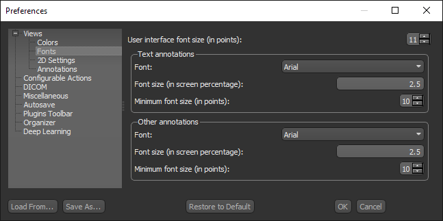
 Selecting the Fonts Preferences
The Fonts preferences determine the appearance of text annotations and text associated with measurements and other annotations. Choose Views | Fonts in the Preferences dialog to view the Fonts preferences, shown below.
Fonts preferences
| Description | |
|---|---|
| User interface font size (in points) | Determines the font size of the user interface text, such as menus, buttons, settings, and so on. |
| Text annotations |
Determines the font face and size of the text annotations that appear in 2D and 3D views.
Do the following to adjust the font properties of text annotations:
|
| Other annotations |
Determines the font face and size of text associated with measurements and other annotations.
Do the following to adjust the font properties of other annotations:
|
Selecting the 2D Settings Preferences
The 2D Settings preferences allow you to configure the appearance of 2D views and the preferences related to the Zoom and Cine tools. Choose Views | 2D Settings in the Preferences dialog to view the 2D Settings preferences, shown below.
2D Settings preferences

| Description | |
|---|---|
| Interpolation |
Determines the interpolation applied to images in 2D views.
Nearest… Is the most basic interpolation scheme and only considers one pixel when filtering. Linear… Considers the closest 2 by 2 neighborhood and then takes a weighted average of these 4 pixels to arrive at its final interpolated value. Will result in smoother looking images than Nearest. Cubic… Is the most basic interpolation scheme and only considers one pixel when filtering. |
| Show text annotations | If selected, text annotations will be shown in views by default. |
| Show legend |
If selected, legends will appear in views by default.
You can also choose an initial orientation for legends — Horizontal or Vertical. |
| LOD in 2D | If selected, the level of detail for 2D views may be diminished during movement. In general, selecting this option will increase speed during manipulations. |
| Zoom at cursor position | If selected, zooming will be implemented at the current position of the mouse cursor. This allows you to easily zoom on a given feature without first shifting the image to the center of the view. If not selected, zooming is implemented from the center of the view. |
| Cine increment |
Determines how stacking through displays in Slab mode is implemented (see Viewing Images in Slab Mode).
Single image… Stacks through all slices in the dataset. Half slab… Stacks through half the thickness value selected for slice integration. Full slab… Stacks through the full thickness value selected for slice integration. |
| Default 2D view orientations | Determines the default orientation — Ascending or Descending — for the X, Y, and Z axes. |
| 3D cursor |
Determines the appearance of the 3D cursor that appears in MPR views in Track mode.
Line thickness… Determines the line thickness of the 3D cursor crosshair, as a screen percentage. Middle empty portion… Determines the size of the space at the center of the 3D crosshair, as a screen percentage. |
| Mesh contour thickness (in screen percentage) |
Determines the thickness of mesh contour lines, as a screen percentage. |
|
ROI and multi-ROI contour thickness (in screen percentage) |
Determines the thickness of ROI and multi-ROI contour lines, as a screen percentage, when shown only in contour. |
Selecting the 3D Settings Preferences
The 3D Settings preferences let you select a default projection mode for 3D views. Choose Views | 3D Settings in the Preferences dialog to view the 3D Settings preferences, shown below.
3D Settings preferences

| Item | Description |
|---|---|
| Axis indicator |
Lets you choose the default appearance of the Axis Indicator (see Axis Indicator).
Cube… If selected, the Axis Appearance will appear as a cube. Arrows… If selected, the Axis Appearance will appear as three interconnected arrows. None… If selected, the Axis Appearance will not be shown. Axis Indicator size… Determines the size, in screen percentage, of the Axis Indicator.
Axis position… Lets you choose a default position for the Axis Indicator — Right corner or Left corner. |
| Default preset |
Lets you choose a default 3D preset that will be applied to renderings (see 3D Presets).
Note You should select the 3D preset that is the most suitable for your typical data as the default setting. |
| Gamma correction | Lets you choose a default Gamma value, which determines how tones are displayed in a view by defining the relationship between input values and the resulting image luminance (see Window Leveling Panel). |
| Interactivity |
Lets you choose an interactivity option, which offer optimal balances of quality and speed for different grade graphic cards and for different stages of visualization workflows. Interactive rendering automatically updates rendered images in real time as you make changes in your scene, such as modifying and transforming objects, tweaking material properties, and adjusting lighting and the camera.
Best quality… Retains the best quality visualizations during manipulations before returning to the set quality. Quality… Retains good quality visualizations for more limited graphic cards. You can also use this mode when you’re nearing the final stages of your visualization process to quickly change and amend your scene, enhance lighting, and change material properties. Balanced… Provides a good balance between quality and speed. Speed… This mode is ideal when working with lower quality graphic cards. Fastest w/ light… Lets you quickly make manipulations without any discernible delay, while still retaining current lighting. Fastest w/o light… Lets you quickly make manipulations without any discernible delay, without the current lighting applied. Use this mode to speed up your visualization workflow from the beginning with almost instant feedback. Note Some settings, such as maximized quality, cubic interpolation, gradient filtering, and virtual floors, can lead to rendering delays. For more speed, you can turn off some of these GPU-intensive features until your visualization workflow is complete. |
| Default W/L mode | Lets you choose a default Opacity Mapping mode for Window Leveling (see Opacity Mapping Modes for 2D Views |
| MPR plane opacity |
Determines the opacity of MPR planes when 2D view planes are shown (see 3D View Pop-Up Menu).
Note The plane or planes will appear whenever the 3D cursor is manipulated in any of the 2D views or if a 2D view is scrolled |
| Thickness of 3D cursor | Determines the thickness 3D cursor, as a screen percentage. |
| Default to orthographic projection mode |
If selected, 3D scene views will appear in Orthographic Projection mode by default (see Perspective and Orthographic Projection Modes).
Show scale bar by default… If selected, the scale bar will be shown by default in Orthographic projections. |
| Cubic interpolation | If selected, cubic interpolation will be applied by default to 3D scene views. |
| Clip box |
Lets you configure the default settings for the clip box, as follows:
Show grid lines… If selected, the grid lines will appear on clip boxes. Show border… If selected, borders will appear on clip boxes. Show ticks… If selected, graduated "tick marks" will appear on clip boxes. You can choose the font properties of tick marks in the Clip box ticks font box. Show axes… If selected, axes will appear on clip boxes. You can add an identified to each axis by checking the Show captions option. Axis size… Lets you choose the thickness, in screen percentage, of the axis lines. Axis length factor (% of box)… Lets you choose the percentage by which the axis lines will extend past the clip box. Clip box tick font… Lets you choose the font properties of tick marks as follows:
|
Selecting the Annotations Preferences
The Annotations preferences determine the thickness of markers such as rulers, angles, and paths, as well as the mouse grab tolerance. Choose Views | Annotations in the Preferences dialog to open the Annotations preferences, shown below.
Annotations preferences

| Item | Description |
|---|---|
| Line thickness | 2D… Determines the thickness of non-text annotations, such as lines, angles, and so on in 2D views, as a screen percentage.
3D… Determines the thickness of non-text annotations, such as lines, angles, and so on in 3D views, as a screen percentage. |
| Legend outline thickness | Determines the thickness of legend outlines, as a screen percentage. |
| Mouse grab tolerance (in pixels) |
Determines the sensitivity of the mouse around object boundaries. The smaller the number, the more accurate you need to be to select an object. For example, a value of 0 means that the mouse needs to be exactly over a line in order to select it. Changing the value to 2 means that if the cursor is 1 or 2 pixels away from the same line you would still be able to select it.
|
| Scale bar | |
| Show scale bar | If selected, scale bars will be shown be default in views by default. |
| Show background | If selected, a semi-transparent background will be added to scale bars by default. |
| Vertical scale bar | If selected, aligns scale bars vertically by default. |
| Outlined | If selected, an outline will be added to the background of scale bars by default. |
| Show numerical text | If selected, the length of scale bars will be shown by default. |
| Horizontal text alignment | Lets you choose how text is aligned by default — Left, Center, or Right. |
| Vertical text alignment | Lets you choose how text is aligned by default — Top or Bottom. |
| Line style | Lets you choose a default line style that has no hash marks, end hash marks, or half hash marks. |
| Line thickness (in screen percentage) | Determines the default thickness of scale bars, as a screen percentage |
| Rulers | |
| Show ticks | If selected, tick marks will appear at the end points of rulers by default. |
| Show background | If selected, a semi-transparent background will be added to rulers by default. |
| Show border | If selected, a border will appear around rulers and their captions by default. |
| Oriented caption | |
| Projected | If selected, rulers will appear 'projected' by default. A projected ruler includes two dashed lines that extend from the start and end points of the annotation with a solid connecting line with or without arrow heads. |
| Drop shadow | If selected, a drop shadow will appear below rulers by default. |
| Horizontal text alignment | Lets you choose how text is aligned by default — Left, Center, or Right. |
| Vertical text alignment | Lets you choose how text is aligned by default — Top or Bottom. |
| Line style | Lets you choose a default line style for rulers — Solid or Dashed. |
| Arrow head | Lets you choose a default arrow head style for rulers — None , Flat, or Barbed. |
| Line thickness | Determines the default thickness of rulers, as a screen percentage |
| Arrows | |
| Drop shadow | If selected, a drop shadow will appear below arrows by default. |
| Line style | Lets you choose a default line style for arrows — Solid or Dashed. |
| Arrow head | Lets you choose a default arrow head style for arrows — None , Flat, or Barbed. |
| Line thickness | Determines the default thickness of arrows, as a screen percentage |